Technographx
How to
Accessories
iPhone
Android
Mac
Windows
Gaming
How to
Accessories
iPhone
Android
Mac
Windows
Gaming
Accessories
Buying Guide
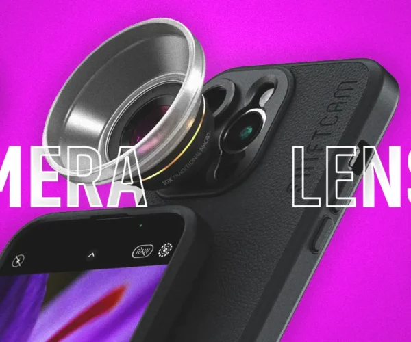
Top 10 Phone Camera Lenses in 2024
Android
Best Android Launchers to Personalize Your Phone (2024)
Android
iPad
iPhone
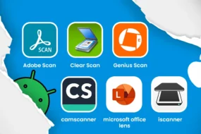
5+ Best Free Scanner Apps for iPhone and Android in 2024
Buying Guide
6 Best TVs Under $500: Big Screen, Small Budget
Tech News
Quantum AI: A Game Changer for Small Investors
Top Stories
iPhone
Mac
Windows
Android
iPad
iPhone
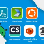
5+ Best Free Scanner Apps for iPhone and Android in 2024
iPhone
How to Install iOS 16 Public Beta on Your Iphone
iPhone
7 Best Journal Alternatives on iPhone
iPad
iPhone
Best Photo Editing Apps for iPhone and iPad
Android
iPhone
Mac
Windows
How to Download Instagram Videos and Photos
Android
iPhone
Mac
Windows
How to Download Instagram Videos and Photos
Mac
Top 5 OCR Software for Mac in 2024
How-to
Mac
Mac Running Slow? 15 Tips to Boost Performance
How-to
Mac
How to Fix Macbook Password Not Working
Accessories
Mac
Best Bags for MacBook in 2024 ( Air and Pro All Size)
Android
iPhone
Mac
Windows
How to Download Instagram Videos and Photos
Windows
10 Most Important Things to Consider Before Buying a Windows Laptop
Windows
How to Clean Windows 10 and Windows 11 : A Comprehensive Guide
Windows
6 Ways to Fix Windows Error Code 0xc00000e
Windows
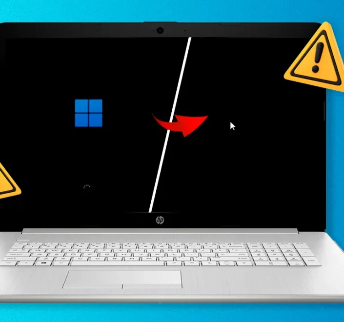
How to Fix a Black Screen on Windows 11
How to
How-to
How to Add Money To Venmo
Samarth Vora
April 1, 2024
4 min read
Android
How-to
How to Hide Apps on an Android Phone
Android
How-to
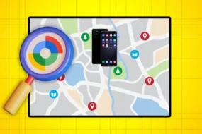
How To Track Your Lost Android Phone?
Android
How-to
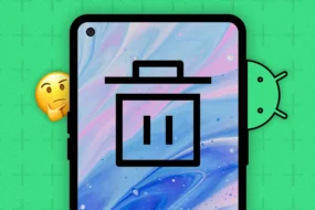
How to Empty Trash on Android Smartphones
How-to
iPhone
What is “Tracking Notifications” On iPhone
More Categories
Gaming
Gadgets
Comparison
Gaming
7 Best Sniper Shooting Games for iPhone and iPad
Gaming
Top 10 Games like Candy Crush in 2024
Buying Guide
Gaming
Best Gaming Chairs Under $100 : Level Up Your Comfort
Buying Guide
Gaming
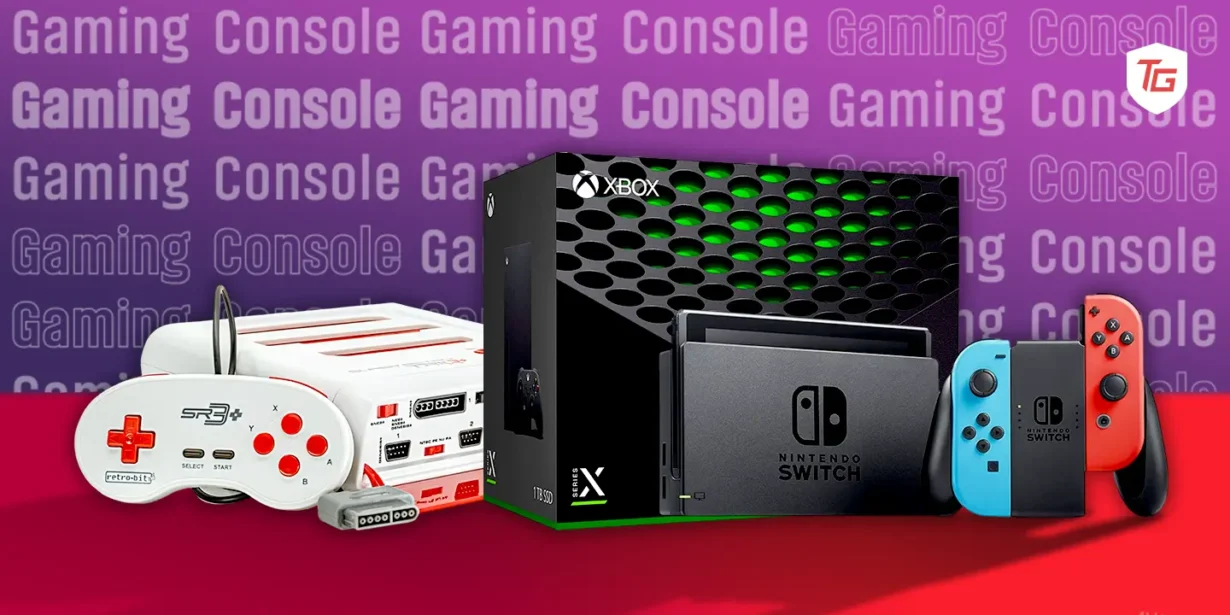
Buy Latest Gaming Console in 2024 : Unleash Next-Gen Power
Buying Guide
Gaming
Most Expensive PCs for Professional Gamers in 2024
Sagar Thakkar
January 29, 2024
9 min read
Accessories
Buying Guide
Gaming
10 Best Gaming Accessories Under $99
Hussain Rangwala
January 29, 2024
11 min read
Accessories
Buying Guide
Gaming
Best Gaming Headsets for 2024: Wireless, Budget, Audiophile, and More
Sagar Thakkar
January 28, 2024
9 min read
Gaming
Top Gadgets
Best Gaming Keyboards for Every Budget in 2024
Sagar Thakkar
January 25, 2024
7 min read
Top Gadgets
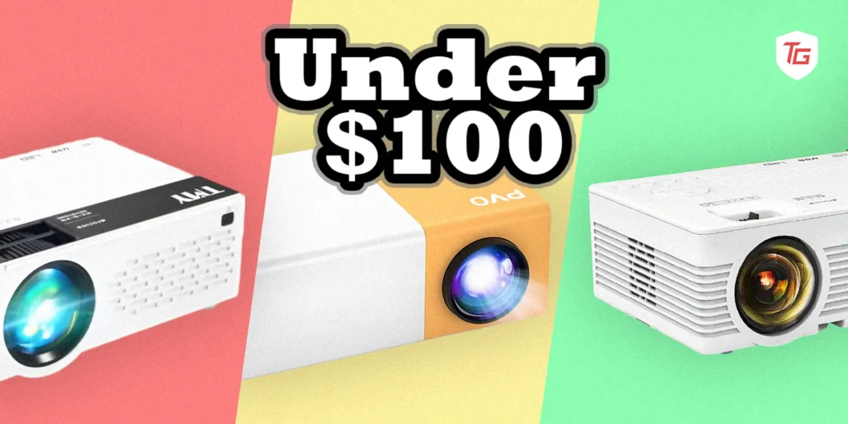
Top-Rated Projectors Under $100 in 2024
Buying Guide
Top Gadgets
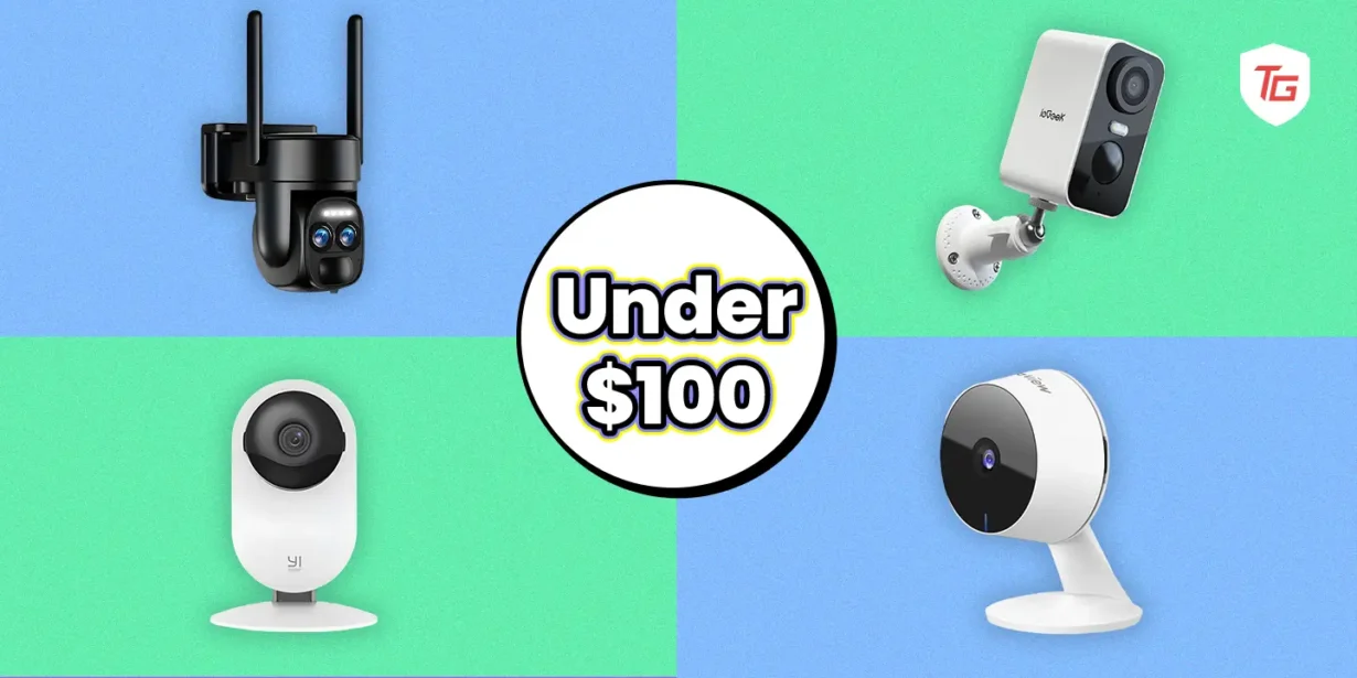
Best Security Camera Under 100$
Gaming
Top Gadgets
Best Gaming Keyboards for Every Budget in 2024
Top Gadgets
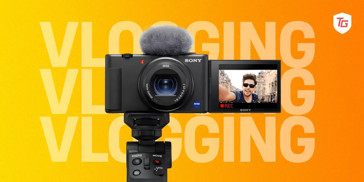
8 Best Camera For Vlogging in 2024
Top Gadgets
Best Drones for Videography in 2024 : Capturing Cinematic Skies
Nishant Desai
December 25, 2023
7 min read
Top Gadgets
Top Smartphone Accessories Everyone Must Have
Nishant Desai
July 29, 2023
11 min read
Top Gadgets
Unleashing the Power of an 85-Inch QLED TV
Nishant Desai
June 9, 2023
5 min read
Top Gadgets
12 Best Hand Grip Camera Strap to Buy in 2023
Hardi Hindocha
March 30, 2023
11 min read
Comparison
Mac
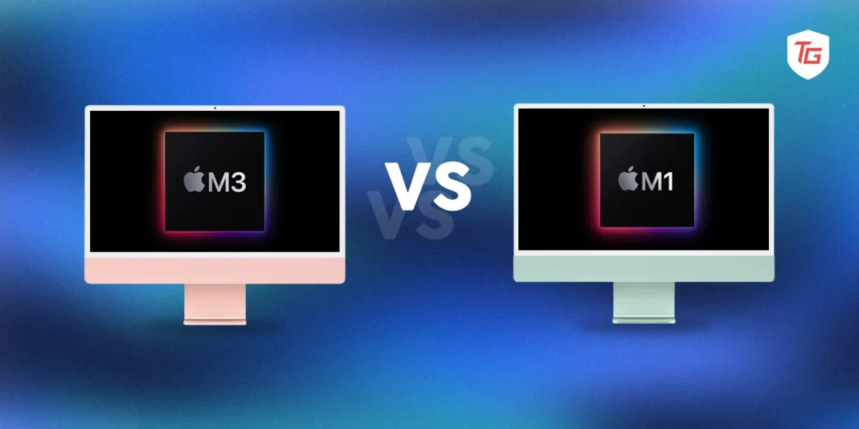
M3 iMac vs M1 iMac: Worth upgrading?
Comparison
Mac
Mackbook M3 Pro vs. M2 Pro: Which One is Right for You?
Comparison
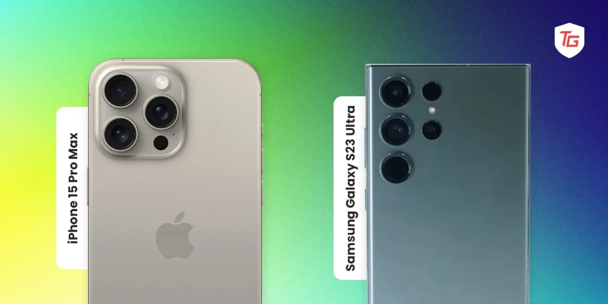
iPhone 15 Pro Max vs. Samsung Galaxy S23 Ultra: Which Phone is Right for You?
Comparison
iPhone
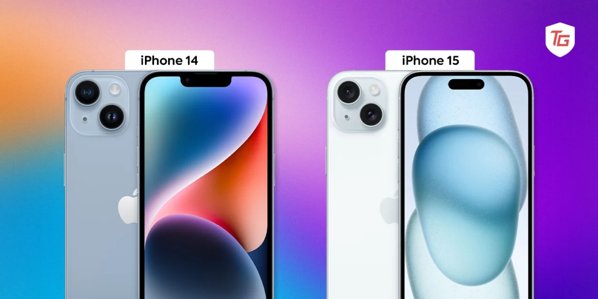
iPhone 15 vs iPhone 14: Which One Should You Buy?
Comparison
Windows
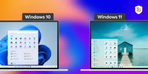
Windows 11 vs. Windows 10: Which OS is Right for You in 2024?
Afam Onyimadu
October 9, 2023
8 min read
Android
Comparison
Google Pixel 8 Pro vs. Samsung Galaxy S23 Ultra: Which is Better?
Sagar Thakkar
October 8, 2023
6 min read
Android
Comparison
Google Pixel 8 vs. Pixel 7: A head-to-head comparison
Nishant Desai
October 6, 2023
6 min read